Design at UCI Project Teams • 3rd Place & People's Choice
PoliPal
A voting companion that helps students navigate elections with clear, accessible information.

ROLE
Product Designer
TIMELINE
Jan 2026 - March 2026
TEAM
6 designers
TOOLS
Figma
Prompt
Designing for the future
Context
Making voting information easier to navigate.
What does the future of informed voting look like for a generation overwhelmed by information?
Our team explored how technology could lower the barrier to civic participation for young voters. PoliPal helps college students navigate jargon-heavy election information through an approachable and neutral digital experience.
Problem Statement
So we asked…
How might we simplify political information and the voting process for first-time and student voters?

Brand identity & logo designed by Yuri Fukuda.
User Research
Competitive Analysis
Existing tools solved pieces of the problem, but rarely brought them together.
We looked at existing civic education tools and political platforms, both consistently fell into one of two traps: either oversimplifying political topics to the point of losing nuance, or presenting information in a way that felt subtly biased.
That gap became our starting point, students needed a platform that trusted them with real information, without pushing them toward a conclusion.

Figure 1. PoliPal Competitive Analysis
We saw an opportunity for PoliPal to combine clear political explanations, structured learning, neutral information, and voting guidance.
User Survey (100+ respondents)
The numbers pointed to a problem with clarity and trust.
Political information wasn't just confusing, it felt risky to engage with. Students worried about sounding uninformed, misunderstanding terminology, or accidentally consuming biased sources. This wasn't a knowledge problem alone; it was a confidence problem.
80% of students want a single, trustworthy place where they can easily access and navigate political information
while 60% of students reported getting political info from social media, 91.7% reported they distrust that information
73.3% of students find political terms and policies difficult to understand, making it harder to interpret
4 User Interviews
Interviews helped us understand the “why” behind the numbers.
Talking directly with students revealed how that anxiety played out in real behavior, several mentioned leaving parts of past ballots blank simply because they didn't understand the terminology, not because they didn't care.

Figure 2. User Interview Questions
Key Quotes
Finding out about it is one thing, but I also want to know why and the costs.
I definitely left some things blank, especially propositions and local positions I didn’t understand.
If it feels too confusing or time-consuming, I honestly just stop looking into it.
USER PERSONA
Designing for the student who wants to care, but doesn't know where to start.
Our persona brought together what the survey and interviews kept surfacing: someone motivated to participate, but held back by unfamiliar language and uncertainty about which sources to trust.

Figure 3. Paul Lee User Persona
Research showed us the problem wasn't a lack of information, it was making it easier to understand and trust.
Design Decisions
What did we do with the research?
Three decisions shaped PoliPal into the final experience.
1 | Simplifying the information, NOT the decision
User testers questioned where information came from, whether multiple perspectives were represented, and how wording could introduce bias.
This reinforced an important boundary for PoliPal.
Rather than…
Candidate A is better for students.
PoliPal's Approach:
Here are Candidate A's positions.
Here are Candidate B's positions.
Here's what this proposition means.
Here are the relevant facts.
You decide.
| Topics Page
PoliPal’s Topics Page organizes civic information around questions, helping them quickly find context while leaving decision-making to them.
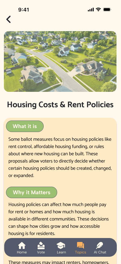

Figure 4. Topics Page Elements
2 | Turning information into guidance
User interviews revealed that students understood voting broadly, but lacked confidence in the specific process and preparation.
| Voting Guide - Personal Contribution!
PoliPal’s Voting Guide gives students clear next steps and connects them directly to official government resources and trusted voting resources like Vote.org for tasks such as registration and voting preparation.

Figure 5. Voting Guide
3 | Building voters for the future
User interviews revealed that limited prior knowledge made political research feel time-consuming. We shifted our learning focus:
Providing Information
Building Knowledge
| Learn Page
Testing validated interactive learning, but brought up the need for variety. While some participants responded positively to quizzes, others questioned their long-term use.
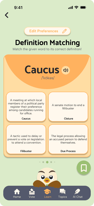


Figure 5. Voting Guide
This reinforced bite-sized, interactive learning while highlighting opportunities for more varied formats.
Final Designs
Branding
Color Palette
Politics didn't need to look political.
Because trust and perceived bias repeatedly surfaced in our research, we avoided the traditional red-and-blue visual language associated with American politics.
Instead, we developed a warm, approachable visual system designed to make learning about politics feel less intimidating while maintaining clarity and credibility.
Typography
Catamaran
Albert Sans
Demo VIDEO
Key Takeaways
What PoliPal taught me.
Research is about focus, not volume
A tight timeline taught me that effective research is about asking the right questions and testing the highest-risk assumptions.

Title
One line to describe the vibe.
Title
One line to describe the vibe.

Title
One line to describe the vibe.

Title
One line to describe the vibe.

Title
One line to describe the vibe.

Title
One line to describe the vibe.
Visual design carries responsibility
Designing for politics taught me that color, typography, and hierarchy aren’t just aesthetic choices—they can subtly shape how information is perceived.
Politics Simplified.

thanks for stopping by~
© emma narvaez 2026