UCI Design-a-thon 2026
Work in Progress
A platform that normalizes sharing your work before it's ready.

ROLE
Product Designer
TIMELINE
48 hours
April 2026
TEAM
4 designers
TOOLS
Figma
Gemini
Notability
Prompt
Chaos into Clarity
Design at UCI's Design-a-thon, General Track. Teams were required to use Notability and Gemini to ideate.
Context
The Messy Middle
Most portfolios only show the finished project. WIP is about everything before that. The drafts, the doubt, the "is this even good?" spiral every designer knows.
Problem Statement
So we asked…
How might we centralize and
de-pressurize designer space to help designers continuously improve themselves and their work?
Research
We started by asking designers what happens after they finish a draft.
We wanted to understand why work-in-progress projects rarely get shared, and what actually stops someone from improving in the space between drafts.
User Surveys
The numbers pointed to a confidence problem, not a skill problem.
From our 33 respondents, people weren't just looking for more design content, they wanted a space built specifically for honest, useful feedback.

want portfolio reviews/critiques
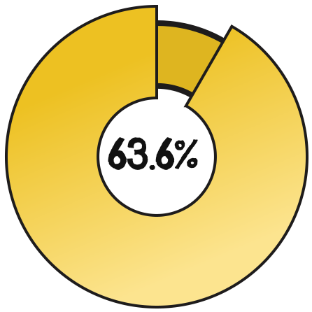
want a centralized design event hub
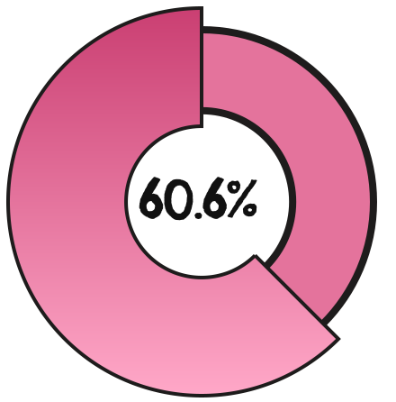
feel unsure what to improve on
User interviews
What we heard
"I save a lot of design posts on LinkedIn, but the posts get lost in everything I save. I wish I had a specific design section."
01
Work never felt finished enough to share
02
Design events existed, but were hard to find
03
Feedback felt vague, not actionable
Competitive Analysis
We studied where designers already go for feedback.
STRENGTHS
+ Comfortable posting unfinished or rough work
+ Real, sometimes blunt critique from other designers
+ Strong sense of community, low pressure to impress
WEAKNESSES
- No organization, posts and feedback get buried fast
- Feedback quality is inconsistent, often just "looks good" or "hard to say"
- No way to track your own progress across multiple posts
STRENGTHS
+ Huge professional reach, visible to recruiters and senior designers
+ Good for building a personal brand over time
+ Easy to save and reference other people's posts
WEAKNESSES
- Rewards only the finished, polished project, no room for drafts
- Feedback is mostly likes/reactions, rarely substantive critique
- Saved posts get lost with no dedicated design section
Neither platform was built for the in-between: real feedback, before something feels finished. That gap is what WIP set out to fill.
User persona
Meet Will.

Will's uncertainty reflects what 63.6% of our survey respondents told us, they weren't short on effort, just clarity.
IDEATION
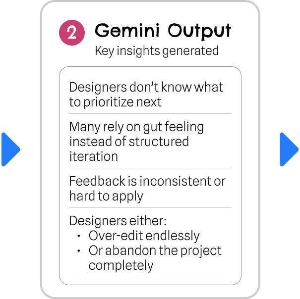
WITH GEMINI
Understanding why designers stall after a first draft.


WITH NOTABILITY
Sketching out how vague feedback could become actionable feedback.

Grouping these ideas revealed three directions worth building around: structured feedback, sustainable habit-building, and a centralized community.
Final Designs
Branding
Color Palette
A brand that looks like what it stands for.


Typography
Chelsea Market
Helvetica Neue
Demo VIDEO
Design Decisions
How did we get here?
We pulled our design decisions directly from what designers told us.
1 | We made feedback impossible to give lazily
Most platforms let you comment "looks good!" and move on. We didn't want that option to exist.
87.9% of designers said feedback isn't actionable, so we built the WIP Status and Requested Feedback block to make sure every comment answers a real question.
| WIP Status & Requested Feedback

2 | We gamified consistency, even though "gamification" felt risky
An Activity streak tracker borrows directly from habit-tracking apps, which isn't a typical UX-portfolio move.
But 60.6% of designers told us they feel unsure what to improve at least sometimes, and staying consistent was part of that same struggle.
| Snapshot Reminders & Activity Streak
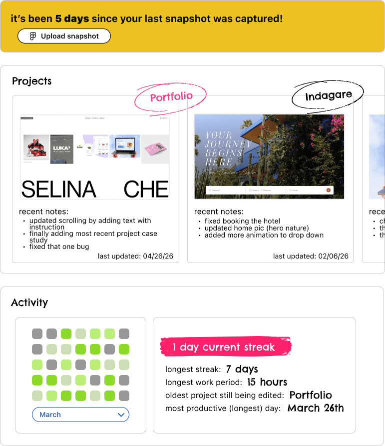
| Activity Log

3 | A Community tab for networking, portfolios, and nearby events
63.6% of designers wanted a centralized design-event hub. We built a Community tab where designers can connect with other designers, browse portfolios, and find design events happening near them — all in one place.
| Community Tab
Key Takeaways
What building WIP in 48 hours taught me
Research is about focus, not volume
With no time for deepened exploration, every decision had to be the right one on the first attempt. This meant leaning harder on research to point us there, instead of iterating our way to it.
Title
One line to describe the vibe.
Title
One line to describe the vibe.

Title
One line to describe the vibe.
Title
One line to describe the vibe.

Title
One line to describe the vibe.
Title
One line to describe the vibe.
Wins
Went from a raw HMW question to a working, research-backed product in under 48 hours
Every decision traces back to what designers actually told us
Title
One line to describe the vibe.
Title
One line to describe the vibe.
Title
One line to describe the vibe.
Title
One line to describe the vibe.
Title
One line to describe the vibe.
Title
One line to describe the vibe.
Next Steps
Run usability testing
Conduct more user interviews
Formal accessibility audits
Build responsive breakpoints for mobile
By Designers,
For Designers
thanks for stopping by~
© emma narvaez 2026